
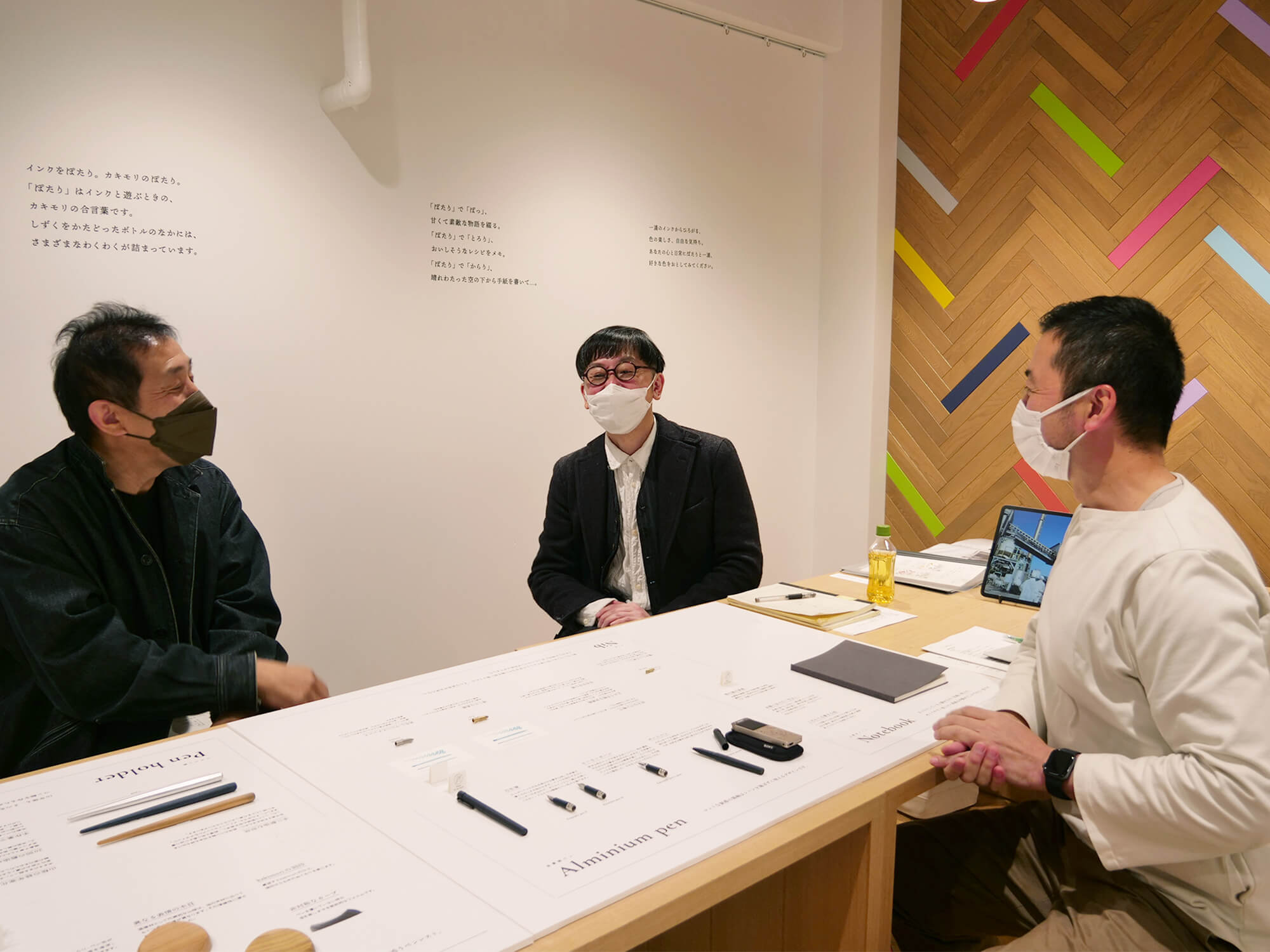
Journeying towards new tools for writing with joy
This is a three-part conversation.
Follow the link below to read from the beginning.
information
A conversation with
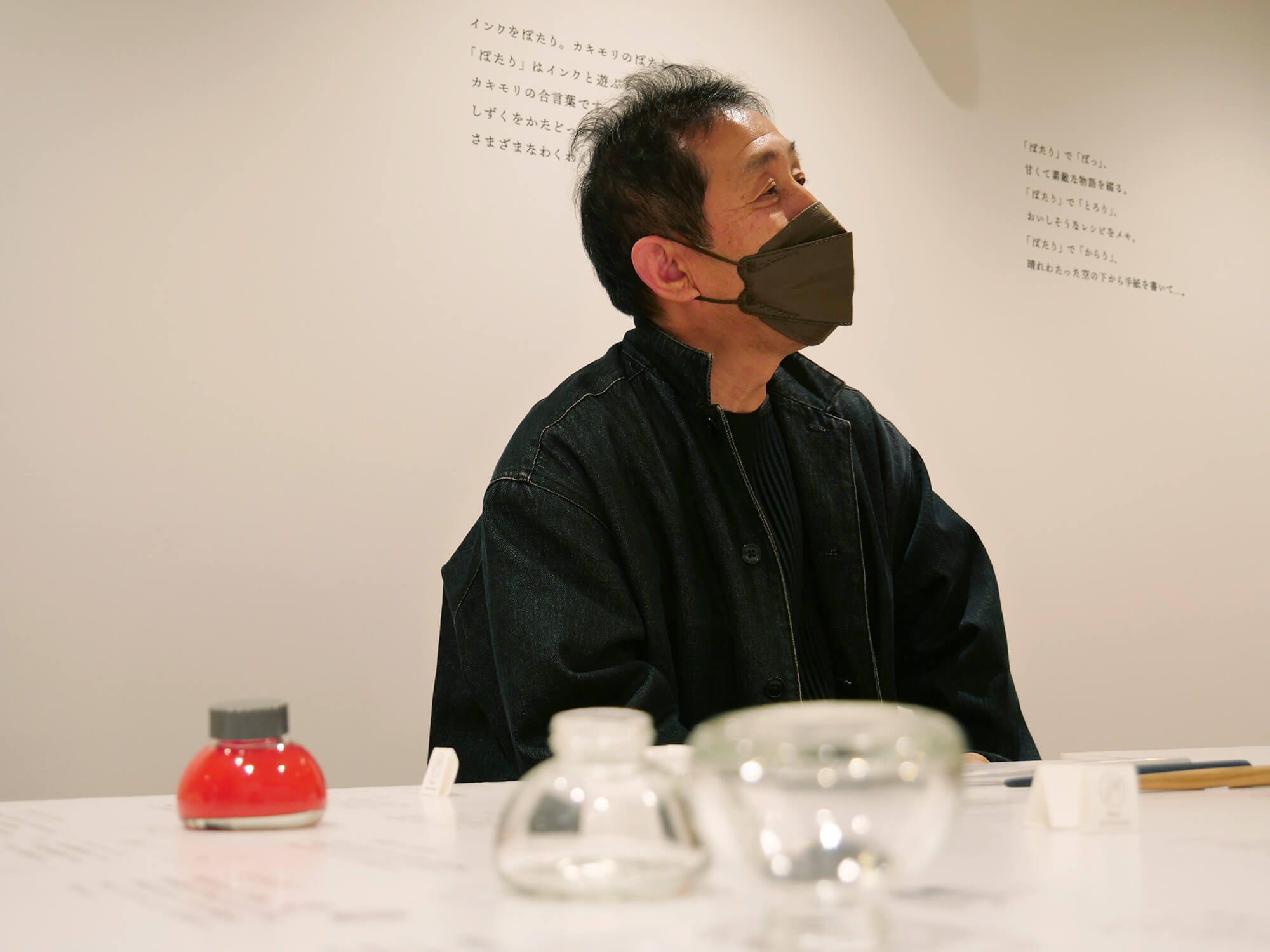
Takuma Hirose:
Founder and director of Kakimori
Founder and director of Kakimori
 ” alt=””>
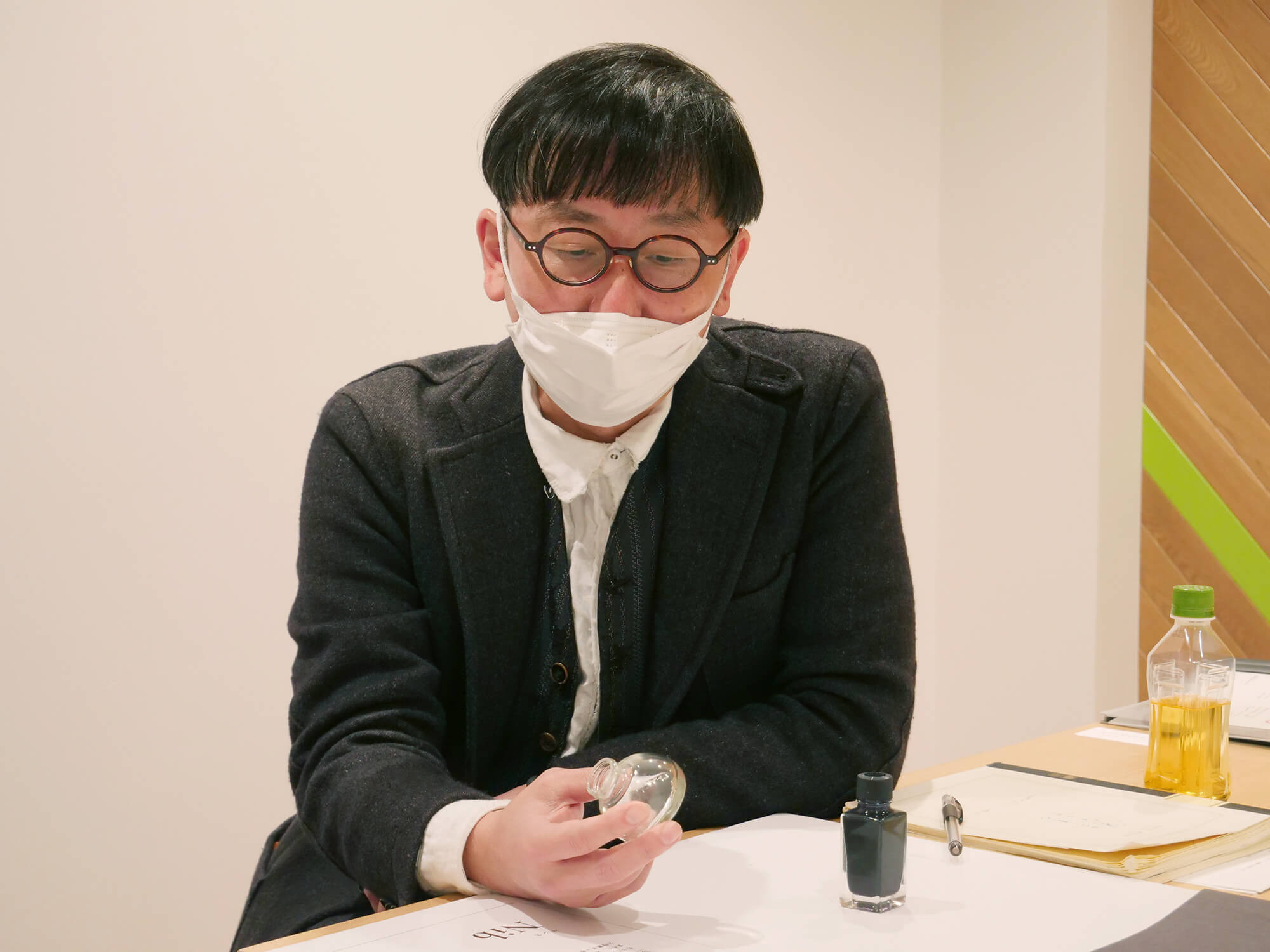
Makoto Koizumi:
Furniture designer and founder of Koizumi Studio
Lead designer of New Tools for Writing with Joy
Furniture designer and founder of Koizumi Studio
Lead designer of New Tools for Writing with Joy
Hiroaki Seki:
Creative director and founder of Mr Universe
Creator of Kakimori’s brand identity
Creative director and founder of Mr Universe
Creator of Kakimori’s brand identity
Well-loved and enduring tools to keep by our side
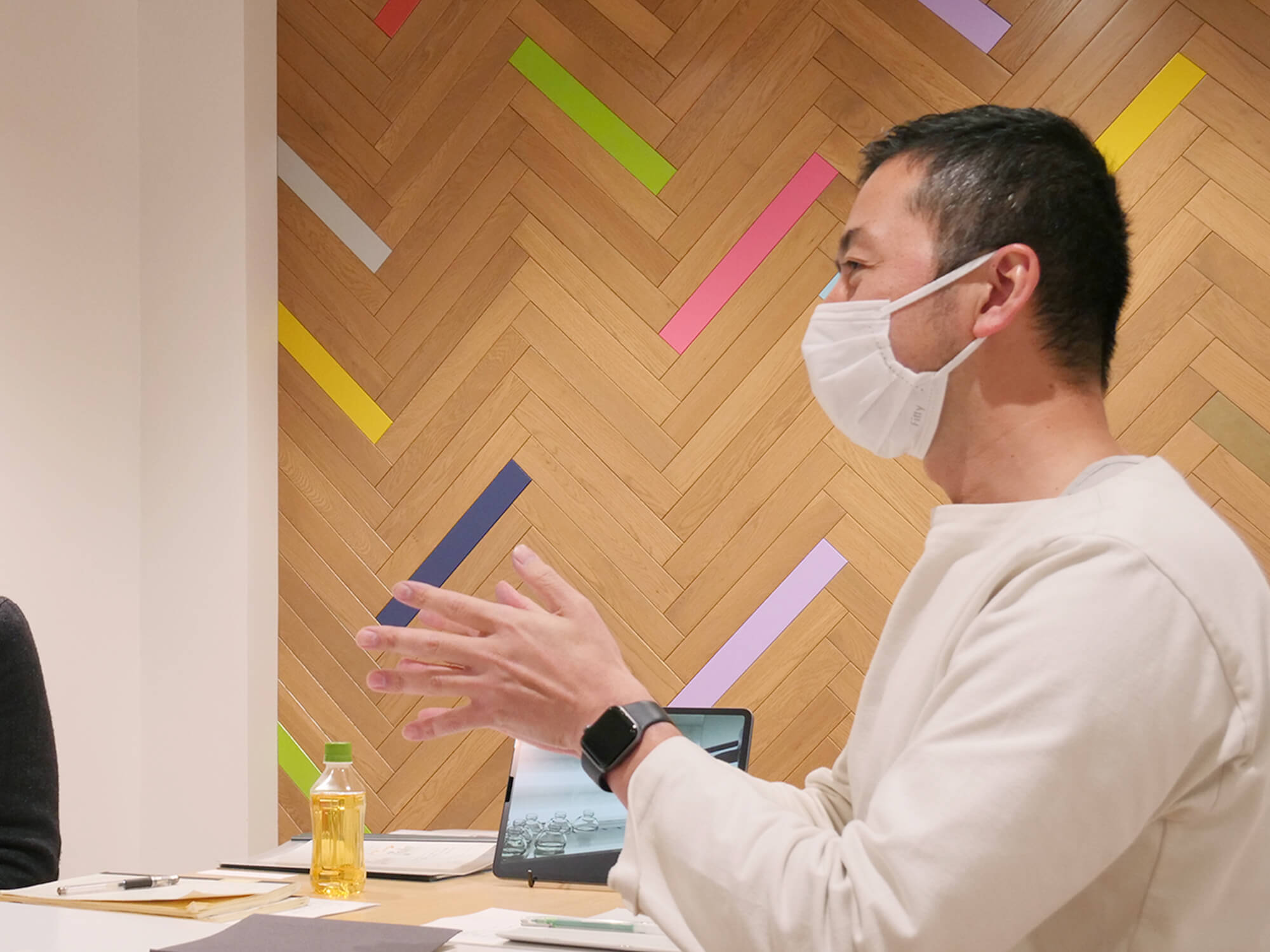
Hirose:
We had several ideas for new products, but first on the agenda was the redesign of our ink bottle.
We had several ideas for new products, but first on the agenda was the redesign of our ink bottle.
Koizumi:
I received from the Kakimori team the most detailed and meticulously researched market analysis of bottled inks. To be honest, after seeing it I felt rather inadequate to give my input [laughs].
I received from the Kakimori team the most detailed and meticulously researched market analysis of bottled inks. To be honest, after seeing it I felt rather inadequate to give my input [laughs].
Hirose: [Laughs].
Seki: [Laughs].
Koizumi:
When I imagined how a Kakimori ink bottle might be used over time, I pictured a well-loved and well-aged tool. I translated this imagery into three fundamental qualities.
Physically robust
Functionally sound
Emotive
I think well-loved tools are objects that have the ability to elicit an emotional response in us, whether by their aesthetic beauty or the attachment that we form with them.
Hirose:
We also stated in our concept research that we wanted to create an ink bottle that still appealed in another hundred years, which closely resembles your sentiment.
We also stated in our concept research that we wanted to create an ink bottle that still appealed in another hundred years, which closely resembles your sentiment.
Koizumi:
Yes, we shared a sensibility and vision early on which shaped our direction.
Yes, we shared a sensibility and vision early on which shaped our direction.
Hirose:
I appreciated Koizumi-san’s attention to “fitness for purpose”, which anchored our approach to products and packaging. There’s often a tendency to overelaborate designs just because we can.
I appreciated Koizumi-san’s attention to “fitness for purpose”, which anchored our approach to products and packaging. There’s often a tendency to overelaborate designs just because we can.
The instantly loved, charming ink bottle
Hirose:
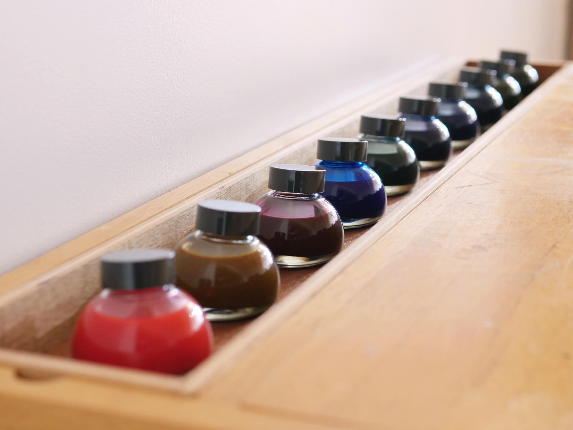
Koizumi-san presented us with five options for the shape of the ink bottle, and we unanimously voted for the round form.
Koizumi-san presented us with five options for the shape of the ink bottle, and we unanimously voted for the round form.
Seki:
I was impressed when I heard that it was nicknamed instantly by the team. It indicated an immediate attraction and connection.
I was impressed when I heard that it was nicknamed instantly by the team. It indicated an immediate attraction and connection.
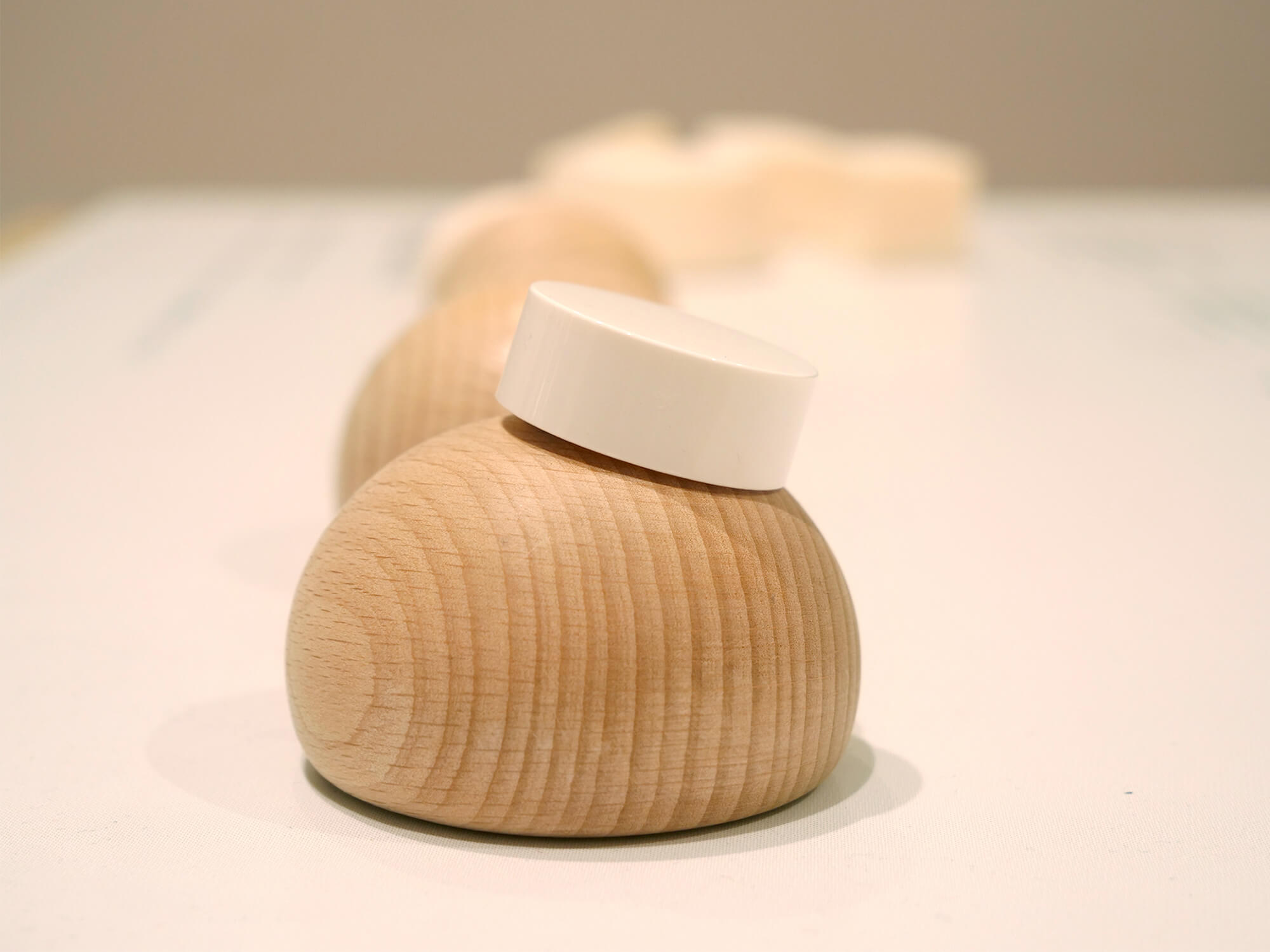
Koizumi:
I was also particularly fond of this one out of the five. The blob-like form was inspired by the process of making Nambu Tekki [traditional Japanese ironware made by pouring molten steel into moulds] whereby the molten steel spits and solidifies into metal drops.
Like the ironware, the ink bottle is also made from molten glass. While designing the bottle I aimed to capture a sense of the liquified glass, so that the bottle appears to almost become one with the ink.
For me, this form fulfilled functionality, aesthetics, and had a story to tell.
Hirose:
In terms of proportion, the shorter height is not only visually pleasing but also more practical to use.
In terms of proportion, the shorter height is not only visually pleasing but also more practical to use.
Koizumi:
On another note, something that bothered me about glass bottles was the knurling on the bottom [the ridges around the edge which prevent damage during production]. I harassed the manufacturer [laughs] until they eventually revealed that they had once used lettering in place of the ridges. I thought of spelling out “Kakimori”, and bounced the idea with Seki-san.
On another note, something that bothered me about glass bottles was the knurling on the bottom [the ridges around the edge which prevent damage during production]. I harassed the manufacturer [laughs] until they eventually revealed that they had once used lettering in place of the ridges. I thought of spelling out “Kakimori”, and bounced the idea with Seki-san.
Seki:
That was fantastic. The addition of the lettering introduced a new context to the bottle as a tool.
That was fantastic. The addition of the lettering introduced a new context to the bottle as a tool.
A proud maker is a sign of a well-made tool
Hirose:
I’m completely enamoured with our ink bottle, if I may say so myself. From the naturally formed thickness of the base to the recycled glass, it’s full of character.
I’m completely enamoured with our ink bottle, if I may say so myself. From the naturally formed thickness of the base to the recycled glass, it’s full of character.
Koizumi:
This was the first time I visited a glass bottle factory. The sheer energy, speed and volume of production was awe-inspiring and gave me goosebumps. The factory team and I worked in unison and it was a pleasure to see the proud look on their faces at the end of the project.
This was the first time I visited a glass bottle factory. The sheer energy, speed and volume of production was awe-inspiring and gave me goosebumps. The factory team and I worked in unison and it was a pleasure to see the proud look on their faces at the end of the project.
Hirose:
I couldn’t agree more, it’s heartwarming to see the makers excited by the outcome. One factory worker told me that he always showed his daughter his work and often didn’t get a reaction, but she absolutely loved our bottle which made all his efforts worth it.
I couldn’t agree more, it’s heartwarming to see the makers excited by the outcome. One factory worker told me that he always showed his daughter his work and often didn’t get a reaction, but she absolutely loved our bottle which made all his efforts worth it.
Koizumi:
That’s great. A real compliment.
That’s great. A real compliment.
Seki:
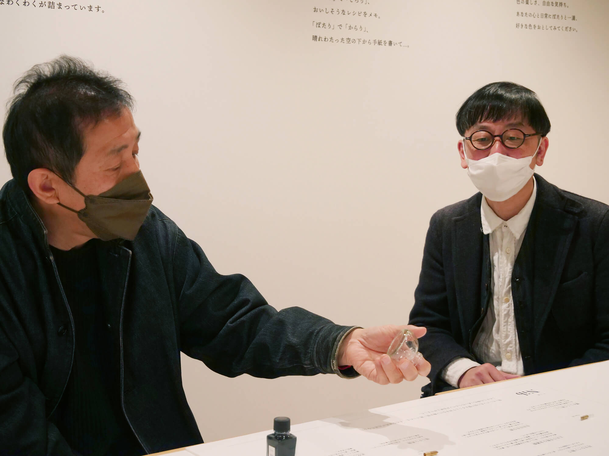
We’d had many conversations about whether ready-made bottles did justice to Kakimori’s unique order-made inks, so I’m very pleased with the result.
We’d had many conversations about whether ready-made bottles did justice to Kakimori’s unique order-made inks, so I’m very pleased with the result.
A growing circle of connection
Hirose:
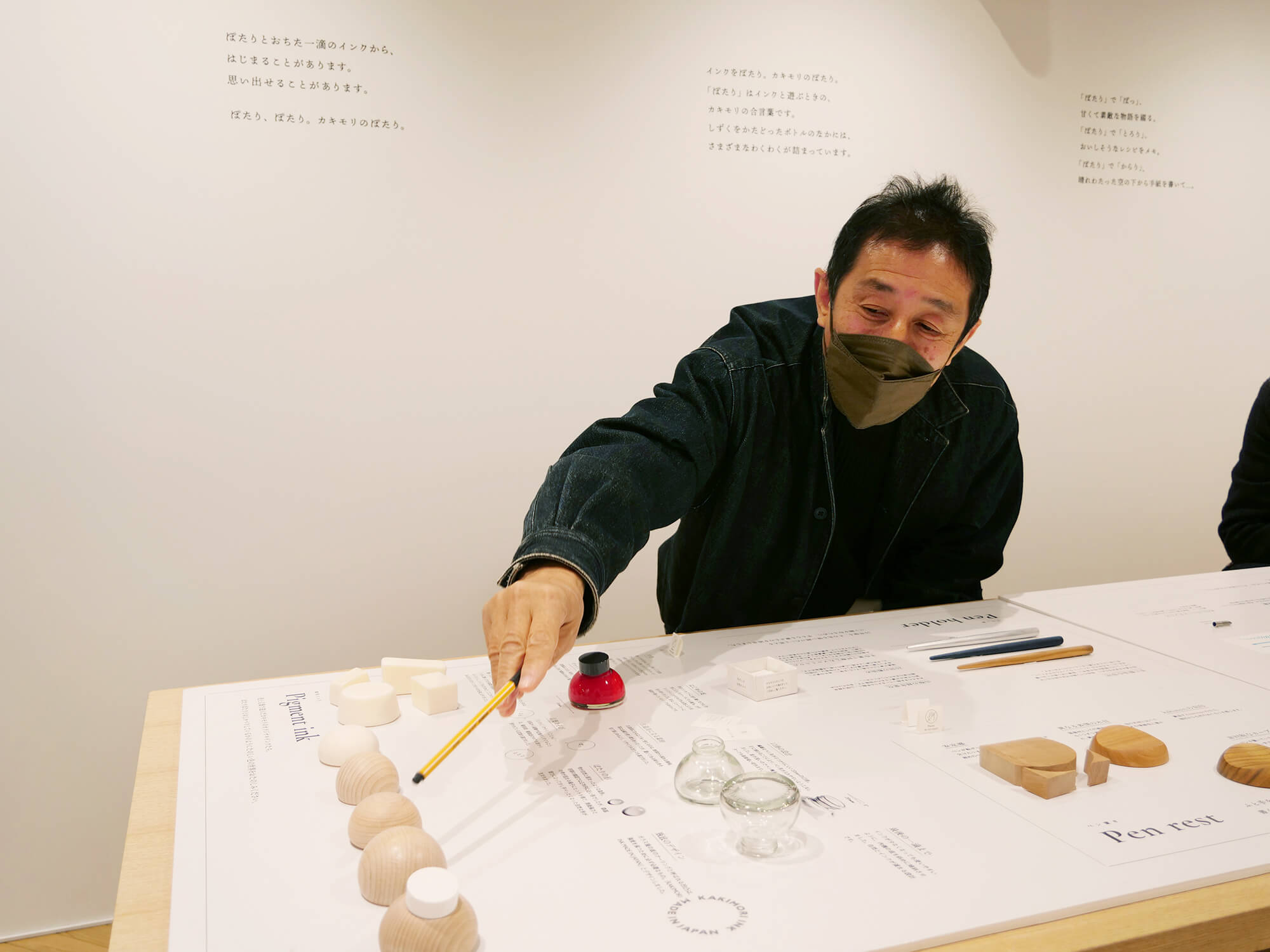
Our dip pens and pen rests were born as complementary items to the ink bottle. During development, wood became a kind of symbol for our collection.
Our dip pens and pen rests were born as complementary items to the ink bottle. During development, wood became a kind of symbol for our collection.
Koizumi:
Hirose-san and I are both committed to using locally sourced materials, and after talking about the Japanese cherry blossom being culturally iconic, I thought wood might be a good choice of material. I could see Hirose-san nodding his head online whenever the subject of wood came up, so I knew he felt the same [laughs].
Hirose-san and I are both committed to using locally sourced materials, and after talking about the Japanese cherry blossom being culturally iconic, I thought wood might be a good choice of material. I could see Hirose-san nodding his head online whenever the subject of wood came up, so I knew he felt the same [laughs].
Hirose:
To create this collection, we engaged the expertise of manufacturers and makers across Japan — the ink bottles are produced in a large factory, the wooden nib holders and pen rests are made in small regional workshops, and the indigo dyeing is done locally in Kuramae. While Kakimori had nurtured strong local connections, working with Koizumi-san opened the door to connecting with more of Japan.
To create this collection, we engaged the expertise of manufacturers and makers across Japan — the ink bottles are produced in a large factory, the wooden nib holders and pen rests are made in small regional workshops, and the indigo dyeing is done locally in Kuramae. While Kakimori had nurtured strong local connections, working with Koizumi-san opened the door to connecting with more of Japan.
A journey travelled hand in hand with makers across Japan. Next, the final part of the conversation reveals the message and storytelling behind the collection.
information